Kika Thorne/medicine: Thinking about the Position Inside

By Rosemary Heather

KIKA THORNE, MEDICINE (2009/12), ELASTIC, HARDWARE, 60′ X 13′ X 11′.

As the circle of projection becomes the rectangle of screen, the transition is a form of the question “How can one thing become something else?”

If cinema and its precedents picture and extend what we can see and experience of our world, what does medicine do? Locate that experience in the body and maybe more to the point in the cells of that body, which are “elastic and magnetic — oscillating, communicating.”[1] What is medicine? Not cinema but its antidote, the artwork that you stand inside, an apparition of that technology which evokes its memory—pays homage to it—while dispensing with any need for cinema’s projections. A kind of medicine for our time, medicine is technology that extends and transforms our world by moving its users deep inside the moment of their own being.

                                                                        —

Think of this essay as structured by a relationship between two concentric circles. In the largest, outside circle we have the field of ideas associated with the concept of posthumanism[2]; in the smaller circle inside of it we have an artwork that can be seen to embody certain aspects of this concept’s meaning. It is important to specify that the idea of posthumanism designates not a progression but a shift, one that we can detect evidence of in Thorne’s work. The “post” appends the “human”, tethers it—to drop the chronological metaphor—to the extended environment within which we are all immersed regardless. The shift resides in a change in how we understand this, a now-in-process transformation in our perception of what constitutes our realm of being.

The concentric circle is proposed as the notional structure for this text as a way to contextualize Thorne’s work in a fashion that is explicitly non-linear. No theory of progress is at work here. The circle is the right spatial metaphor as it implies a concatenating field of associations, or in other words, modulating ripples of meaning.  The two concentric circles propose a relationship, one that subsumes the broader framework of posthuman thought within a much more specific context: that is, an artwork made by Kika Thorne, which is as it should be.

In her own words, Thorne articulates the central investigation of her recent work as an attempt to bridge the divide between “utopianism and the capacities of the artwork.”

The artist’s long standing engagement with anarchist thought is important to the understanding of her practice as a whole and is the framework within which her use of the word “utopianism” takes its meaning. Thorne identifies as formative a milieu of artist-architects with whom she first began to develop her art practice, specifically naming Barry Isenor and Kenneth Hayes, creators of the seminal architecture zine, The Splinter (1989-1994)[3]; Marie-Paule Macdonald, coauthor with Dan Graham of the equally influential, Wild in the Streets: The Sixties (1994)[4]; and Luis Jacob, Allan Antliff and Adrian Blackwell, with whom she started the Anarchist Free School (1999) in Toronto’s Kensington Market. Working with this cohort and others, especially Adrian Blackwell, Thorne participated in the production of a number of projects intended to function as critical-Utopian introjections into public dialogues about urban and social issues that were urgent to their time. These projects took place under different guises, the group at different times and with differing configurations of members naming itself: The C-Side Collective, Fabricator, the October Group, the February Group and the April Group (which included Cecilia Chan and Christie Pearson) among others.[5]

How can making art be a political act? Art as an experience emanates from a particularity, a location in a time and place. In a literal sense, location is a limitation. An art context can only temporarily be a command center for activism; the opportunities it offers for the building of a lasting communal culture are limited. Instead, art allows for experiments in a different kind of potential, one that every artist seeks to realize in their work. Artworks can transform you when they simultaneously enhance and obliterate the circumstances in which they are encountered.  How this translates into a politic, into an enacted Utopianism as opposed to an imagined one, is the central question of Thorne’s work, one to which she proposes possible solutions that are entirely in keeping with art’s circumscribed realm of efficacy. It is important to emphasize that posthumanism is not intended to evoke a cyborg future for humanity. Instead, the term “recognizes the embeddedness of human beings in not just its biological but also its technological world.”[6]  This is an embeddedness that, in the artist’s terms, extends to the molecular level. Thorne quotes Walt Whitman: “My tongue, every atom of my blood, form’d from this soil, this air.”[7] Similarly, Thorne describes medicine, an artwork constructed from elastic cords, as a kind of molecular event, the artist working with materials to produce “an affinity of matter… the electrostatic energy of rubber’s stored bond distortions inducing vibration. I am not the author of this energy, just a collaborator.”

Posthuman thought holds out the possibility for a new vantage point for the human, one that emanates from the ground up. The goal it proposes: for the human perspective to become embedded within its wider environment, which is also true of the particular vantage point of Thorne’s immersive sculpture facilitates for its audience. In the posthuman, the human being becomes humbled, its assumed omniscience pulled back to earth to become grounded in, and refracted through, the material world in all of its multifaceted capacities. Posthuman thinkers seek a way forward out of an impasse of environmental destruction and unending economic crisis by ushering in a new era of human self-demotion. Considering it practical limitations, what can art bring to the conversation? Examination of Thorne’s work medicine can show how a collapse of perspective, of subject-object positioning, brings with it a necessary decentering, immersing its subjects within the concatenating vibrations of the paradigm that is now emerging.

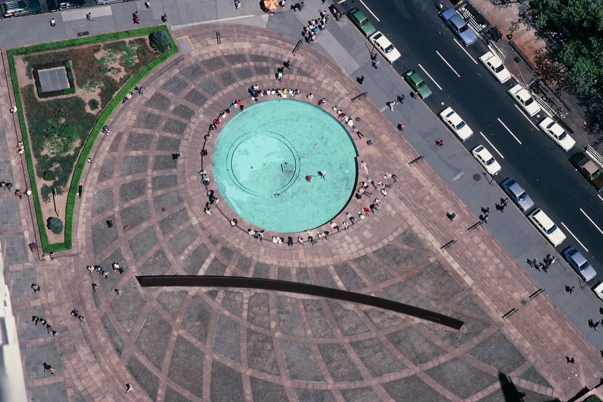
The work medicine uses a single aperture in the centre of a gallery wall to structure a circle of 88 radiating black elastic cords that extend outward across the room to meet the rectangular frame of the far wall, which in the version of this work I saw at Toronto’s G Gallery[8], happens to be the frame of the space’s floor to ceiling glass-window entrance. A dazzling work, medicine has a powerful effect far beyond the modest sum of its materials. It derives strong graphic impact from the contrast between the black cords the bright white light of the gallery space. As Adrian Blackwell, the artist’s frequent collaborator notes, medicine is “highly architectural as both constructed space and a linear drawing.”[9] Experience of medicine also impacts the body. The installation fills the space, to a certain extent displacing or impeding gallerygoers, who choose to negotiate the work by entering into it, engaging with an experience not available to those who choose to remain at its perimeter.

In its simplest form, a historiography for the artwork can be found in the precedent that will come to be understood differently, in a new light, when considered from then viewpoint of its successor, and vice versa, a circle crossing over itself, each helping the other to more clearly define its significance to its time. Thorne notes that the precedent for medicine is British artist Anthony McCall’s Line Describing a Cone (1973)[10], a film of a white dot on a black background that over a thirty-minute duration becomes a circle describing the space within the circumference of its frame. As the circle grows the projector beam gradually expands to become a cone of light. Writing about the work, Colby Chamberlain notes the work, “utilized the barest elements of film—celluloid and projected light—but it clearly needed to be experienced as a three-dimensional object, like a sculpture.[11]

When comparing Line Describing a Cone with medicine, it is easy to detect two distinct paradigms: postminimalism and posthumanism, respectively. McCall’s “solid light installation” (one of a series the artist made) can be considered postminimalist in that he theatricalises cinema so that it becomes pure event, one that foregrounds the medium’s structural components. Line… forgoes a dependence on narrative and instead implicates its audience corporeally in the construction of its meaning.  The posthuman implications of Thorne’s work reside in subtle variation on and extension of McCall’s accomplishment, as I hope will become evident below. What Line Describing a Cone/medicine share in common is, first, their formal structure: both artworks formally mimic the (film-based) spatial arrangements of cinema, projecting image and light through a lens across a room onto a definite field in front of it that is usually, but not always, a screen. Second and more important, both works forego the cinematic image, the very point of cinema, in favour of becoming the image itself. The appellative “Cinema without an Image” applies to both artworks, but it is arguably of greater significance in relation to medicine, in that Thorne’s work subsumes within it salient features of contemporary experience, the everyday distortions of time and place that come with the use of the internet, being one example. A text about McCall’s work at the Harvard Film Archive notes, “McCall’s focus on activating the participants and the site transcended the medium and pared the artistic process and concept down to its paradoxical and essential crux.”[12] Implicit to this statement is the idea that Line Describing a Cone encapsulates cinema as an art form, as if from the work’s vantage point we see the medium in a rearview mirror receding in historical time. Arguably this is the meaning of the activated spectator of the postminimalist artwork who, no longer the passive viewer, is invited to occupy the exhibition’s figural center stage along with the work. Though the light cone creates a definite boundary, one that could be transgressed, the cinema without an image is in this case a theatre with an elective proscenium. With the advent of the digital era, film seen as a light projected is almost a thing of the past and perhaps this was a message Line Describing a Cone subtly intimated. Making use of the material components of cinema, Line Describing a Cone is cinema made whole, seen within framework of the historically-determined form of perspectival vision that made it possible; as Adrian Blackwell observes: “film has a unique relationship to perspective, because it constantly repeats the act of projection that is perspective each time it is shown.”[13] By contrast, because of the way it changes the audience’s relationship to the artwork, medicine can be seen to shut the door on the historical era perspective that McCall’s work encapsulates. Enter into medicine and you cross a threshold, the work creating a space for its audience that is no longer the stage for a performance (i.e., the performance the audience enacts when it joins the artwork on the stage of postminimalism.) Instead of a space constructed to facilitate perspectival relationship to the artwork (or the transgression of such), medicine creates the experience of that relationship breaking down. Every position the audience might take in relation to medicine is the correct one and at the same time no more necessary to its experience than any other. Parity between audience and work is at the core of medicine‘s meaning, its relativism exactly scaled to the body of each participant who engages with it.

German art historian Erwin Panofsky, writing in the early part of the last century, noted that the geometrically correct perspectival space of pictorial representation was an invention of the Renaissance.[14] In a passage taken from his essay Perspective as Symbolic Form (1924-25) that could also be describing the radiating lines of Thorne’s work, Panofsky writes:

I imagine the picture…as a planar cross section through the so-called visual pyramid: the apex of the pyramid is the eye, which is connected with individual points in the visual image…the relative position of these “visual rays” [determining] the apparent position of the corresponding points in the visual image.[15]

Panofsky’s goal was to denaturalize linear perspective and recharacterize it as historical style, making it apparent that at the very least linear perspective is unfaithful to the physiological truth of how we see the world. From the vantage point of the early 21st century, a certain resonance comes from noticing that the German historian was writing around the time of cinema’s (the camera’s) first decades, when we can assume the art of “almost scientific”[16] pictorial representation was receding into the past of its historical relevance[17]. A further interpretation might extrapolate: Panofsky’s text suggests the symbolic, historically-specific purpose perspectival vision was meant to serve, which was to foster a broad, if not to say colonialist, cohesiveness. Out of the homogeneity of the picture plane that realizes “in the representation of space precisely that homogeneity and boundlessness foreign to the direct experience of that space”[18], come ideas about a further homogeneity: that of the beholder’s worldview. Certain implications are obvious, say an Imperialism that conquers to assimilate all within its dominion, to give one example. A similar kind of extrapolation could be made from Thorne’s work, inferring from the concrete example far reaching implications. Panofsky describes a visual pyramid at the apex of which is an eye, but he does not note that this description leaves the Renaissance regime of vision in a curiously disembodied state. By contrast, visual experience of medicine is an incorporated aspect of its experience as a whole. Medicine posits a body integrated with its environment, not floating above it but grounded in and extended by virtue of the immediate materials through which it is made. In other words, an experience of medicine is like an experience of the embedded perspective on the world posthuman thought argues for.

As a non-Humanist work (in the Renaissance sense) medicine can be described within the framework of the Actor Network Theory (ANT) developed by French sociologist Bruno Latour and his colleagues, which has gone on to become foundational for what is now emerging as the body of Posthumanist thought. It pays dividends to note certain affinities, however superficial, between the work and the theory.  For instance, the networks theorized in ANT “exist in a constant state of making and remaking.”[19] Similarly, medicine’s requirement of total body immersion will reward participants with an experience of scale that is contingent and variable. Each body becomes the measure of the work, each individual negotiation of medicine “making and remaking” it.  However, variability in experience of the work should not be understood to evoke ideas about relativism. Panofsky’s translator Christopher Woods writes, “Perspective since the Renaissance also means relativism. It suggests that a problem is always framed from a particular point of view.”[20] In the world medicine describes, however, there is no point of view, only relationships produced within—and that produce—its network.[21]

Medicine dispenses with any need for linear perspective as a necessary component of the artwork. Instead, the work retains only the trace elements—the skeletal outlines of—the cinematic regime of vision that was so central to the experience of the 20th century. The lines of the work converge but never cross; they don’t culminate in an image, or follow the beginning-middle-and-end logic of a film narrative. While referring to cinema in an overt way, the work offers its participants an entirely other experience, in the process pointing to certain emerging characteristics of the Zeitgeist. For instance, in a time of massive digital image proliferation and distribution, medicine cannot be pictured. It definitively does not exist in this way, although the lens of the camera can seek to capture its various aspects, resulting in striking photographs (especially portraits, as if producing a quaint memorial for ‘the human’). This suggests proliferation of the image is the same thing as loss of its meaning as a singular entity. In this sense, medicine has little in common with the pictorial homogeneity which Line Describing a Cone can easily produce as an artwork. The latter activates the subject in a similar way perhaps, but never as a beholder of the work. Instead, a loss of perspective for the participant is central to its experience, which is no less coherent as a result.

Christopher Wood notes “Renaissance perspective…had in Panofsky’s eyes the virtue of insinuating a perfect equilibrium between the claims of subject and object.[22] Medicine, however, requires no subject in “equilibrium with its pictorial object.” Rather, a visitor subsumes medicine within him or her-self in the same way that they are subsumed within the artwork. In addition to there being no correct perspective from which to view the work, the concept of taking a position outside of it is all but meaningless to the worldview it defines[23].  Instead, engaging with the work requires a degree of entanglement within it, the audience’s visual perspective being no longer sovereign but an incorporated and intermittent component within its material. Engulfing the subject, medicine constructs contemporary experience from a position inside, producing within itself certain characteristics of the world we find ourselves emerging within.


[1] Kika Thorne, in conversation, August, 2012.

[2] A related context for posthuman thought is the Deep Ecology movement Thorne suggests the rise of posthuman thought illuminates the demands of the Deep Ecology movement to which she belongs. Naess, Arne. “The Shallow And The Deep, Long Range Ecology Movements”, a Summary. Originally published in Inquiry (Oslo), 16 (1973). Naess states seven main tenets of the movement. I quote from each section: 1. Rejection of the man-in-environment image in favor the relational, total-field image. Organisms as knots in the biospherical net or field of intrinsic relations. 2. Biospherical egalitarianism-in principle. The “in principle” clause is inserted because any realistic praxis necessitates some killing, exploitation, and suppression. The ecological field-worker acquires a deep-seated respect, or even veneration, for ways and forms of life. S/He (sic) reaches an understanding from within, a kind of understanding that others reserve for fellow humans and for a narrow section of ways and forms of life. To the ecological field-worker, the equal right to live and blossom is an intuitively clear and obvious value axiom. Its restriction to humans is an anthropocentrism with detrimental effects upon the life quality of humans themselves. The quality depends in part upon the deep pleasure and satisfaction we receive from close partnership with other forms of life. 3 Principles of diversity and of symbiosis. Diversity enhances the potentialities of survival, the chances of new modes of life, the richness of forms. “Live and let live” is a more powerful ecological principle than “Either you or me.” The latter tends to reduce the multiplicity of kinds of forms of life, and also to create destruction within the communities of the same species. 4. Anti-class posture. Diversity of human ways of life is in part due to (intended or unintended) exploitation and suppression on the part of certain groups. The exploiter lives differently from the exploited, but both are adversely affected in their potentialities of self-realization. 5. Fight against pollution and resource depletion. In this fight ecologists have found powerful supporters, but sometimes to the detriment of their total stand. 6. Complexity, not complication. Organisms, ways of life, and interactions in the biosphere in general, exhibit complexity of such an astoundingly high level as to color the general outlook of ecologists. Such complexity makes thinking in terms of vast systems inevitable. It also makes for a keen, steady perception of the profound human ignorance of biospherical relationships and therefore of the effect of disturbances. 7. Local autonomy and decentralization. The vulnerability of a form of life is roughly proportional to the weight of influences from afar, from outside the local region in which that form has obtained an ecological equilibrium. This lends support to our efforts to strengthen local self-government and material and mental self-sufficiency. But these efforts presuppose an impetus towards decentralization. Local autonomy is strengthened by a reduction in the number of links in the hierarchical chains of decision.

Reprinted in http://www.alamut.com 1999.

[3] Published in Toronto, The Splinter used the self-publishing “zine” (from “fanzine”) format to create a platform for grassroots dialogue about architecture. The terms “zine” originates in the D.I.Y. ethos of punk, and punk attitude defines the tone Hayes and Isenor adopted for the missives they launched against the world of establishment architecture practice. http://laforum.org/content/articles/architects-architecture-activism-by-david-jensen

[4] Wild in the Streets is an artist book, a “mini rock opera” in part based on the 1968 film of the same name. Whereas the film brings b-movie sensationalism to the revolutionary impulses of 1960s youth culture, Graham and MacDonald use the reference as a way to reflect on the failed promises of that cultural moment. https://www.frieze.com/issue/article/the_psychedelic_fantasies_of_the_sixties/

[5] More information about this era in Thorne’s practice can be found at http://kikathorne.blogspot.ca/

[6] Cary Wolfe, What is Posthumanism? (Minnesota: University of Minnesota Press, 2010) xv.

[7] Walt Whitman, Song of Myself, Section 1, (Digireads.com, 2006)

[8] Kika Thorne, mediCine, G Gallery, Toronto, July 13 – August 12, 2012.

[9] Adrian Blackwell, “White Wall / Black Hole System: drawing lines between cinema and architecture, galaxies and souls”, poster accompanying the G Gallery exhibition.

[10] McCall cites as precedents to Line Describing a Cone, Warhol’s Empire (1964) and Michael Snow’s Wavelength (1967). Both are works that emphasize the material aspects of cinema as a process, to create an experience of the medium that is largely external to the images each one projects.

[11] Colby Chamberland, “Something in the Air”, Cabinet, Issue 35 “Dust Fall”, 2009 http://cabinetmagazine.org/issues/35/chamberlain.php

[12] http://hcl.harvard.edu/hfa/films/2012aprjun/mccall.html

[13] Blackwell, ibid.

[14] Erwin Panofsky, Perspective as Symbolic Form, trans. Christopher S. Wood, New York: Zone Books (1991) 27. Originally published as “Die Perspektive als ‘symbolische Form,’ in the Vorträge de Bibliothek Warburg 1924-1925 (Leipzeig & Berlin, 1927), pp. 258-330.

[15] Panofsky, 28.

[16] With perspectival techniques of the 15th century “painting is sometimes indistinguishable from science.” Christopher S. Wood, “Introduction”, Perspective as Symbolic Form, 23.

[17] Blackwell “today photography, film and video persist as its living descendents”, ibid.

[18] Panofsky, 31.

[19] Bruno Latour, Reassembling the Social, (Oxford: Oxford University Press, 35.)

[20] Woods, 23.

[21] Within the logic of ANT, this network would be comprised of every component that produced the result of visitors appearing at the gallery door, including the artist’s friends and colleagues, meaningful art historical precedents, the institutions of art education and the Liberal Arts generally, a local art community and the mechanisms by which it publicizes itself, not to mention, the systems responsible for the manufacture of black elastic cord and wall paint, cars, public transit and bicycles, etc. Furthermore, ANT assumes these “networks of relations are not intrinsically coherent” but they can potentially of course crystallize as such.

[22] Wood, 23.

[23] Taking an outside position suggests a number of ideas, all of them arguably concerns no longer relevant to the 21st century, including: mastery and the hierarchy that falls beneath its summit; the proprietary advantage and subject-forming resolution associated with a point of view; the romantic individual who decides to reject the world; the militant who actively fights back against it; and the avant-gardist who presumes to lead it.

This essay originally published in the catalogue for, The Wildcraft, Kika Thorne’s solo exhibition at the Art Gallery of Windsor, 2012.

Public Art and City Planning – A Conversation with Jane Perdue

Interview by Rosemary Heather and Yan Wu.

“Two Circles” by Micah Lexier, Two circles of identical size, identically positioned on either end of the lobby. One circle is solid black, the other a thin, black outline. Bay Adelaide Centre, Toronto. Photo by Tom Arban.

In the second interview in the series, Public Art and City Planning – A Conversation with Jane Perdue, Yan Wu, Public Art curator for the City of Markham, and art writer Rosemary Heather, talk with Perdue about her career, the changes she has seen over the years, what tools planners have for the provision of public art, what it’s like to work with private developers, and whether she has a favourite amongst the hundreds of Toronto’s public artworks.

Jane Perdue has worked as the City of Toronto’s Public Art Coordinator for the City Planning Division for almost three decades. As an independent consultant, Perdue developed a Public Art Policy Framework for the City of Markham (then Town of Markham) in 2003, predating the public art program that was formalized in 2013. Perdue has also worked with other municipalities in Ontario and Canada on developing public art policies and public art master plans.


RH: How long have you been in the field of public art and what are the major shifts you have seen over the years?

I was hired by the City of Toronto in 1991, so I’ve been with the City for almost 30 years full-time as City Planning’s Public Art Coordinator. I studied film history and art studies and after I graduated from York University my background in public art really started when I was hired at A Space, the artist run centre. I was hired by AA Bronson of General Idea at A Space. I had some idea about General Idea, but I did not realize that I had such a wonderful opportunity. I worked with them for four years. We did a number of satellite projects. Some of them were on the TTC. Ben Mark Holzberg created a project called Rolling Landscape, using Cibachrome in the ad space inside subway cars and also installations in the bus shelters. So that was really innovative, it was around 1980-81. A Space also sponsored a performance at Nathan Phillips Square, with Marina and Ulay, and that was a fabulous opportunity for me to help with that. It was a 24-hour performance of Marina Abramovic and Ulay staring at each other. Then I was appointed to the Public Art Commission in 1985 and was on the Commission for four years as a volunteer to help advise the City. I came to the City with a visual art and film background but I became an accredited planner about 12-13 years ago, because I realized how interesting planning was and I wanted to understand better how planning worked. For my first assignment, it was urgent, I had to help write a report for something that didn’t happen for another 25 years and I had trouble for a while understanding that but that was also a lesson realized: you plan for an idea and it may take a decade or two to actually be fulfilled. As far as changes, at the beginning we would be speaking with the architect with the developers and urban designers and so on and it was a very conservative approach and it was usually sometimes they are already had an artwork in mind that they thought would just be perfect for the site and they wanted to know where they could site the plinth. So it was really about an independent sculpture—and there is nothing wrong with that—but the change has been over the years is about looking at the various opportunities for how public art may play a role in defining a character or identity or terminus, or locating people to an area as a draw. The public art might be part of the community planning guidelines and the urban design guidelines objectives, so the understanding has expanded in that way.

RH: A lot of public art today is associated with condo development. Can you describe what public art looked like before there was so much development happening in the city?

When I started, it was a recession, so there wasn’t a lot going on. There were a lot of policies that were put in place. Our official plan came in, I think it was 1994, and before that we had hired a woman—Patricia Fuller—who is very well known in the States as a public art consultant. She helped us to do what we called City Plan 91, and we had a whole chapter on public art. We were very new at it as far as implementing policies and programs. Before I was hired, Ken Greenberg, who is very well known in Toronto, was running the Urban Design section and worked with a woman—Mary Lynn Reimer —and they looked at policies and programs in the United States, because those started in around 1960, 1959. We were looking at examples that might fit for Toronto. That’s why there was a public art commission in 1985. We didn’t have a lot of programming then but that was the beginning of it, looking at the processes and what would work. Since then, yes there’s been a lot of condominiums that have been built, but that’s the market. That’s not our policies, that’s what the market has offered. But we do have public art in offices and in other institutions for sure, and there’s a number of examples that are across the city and it’s not just in the downtown core. Development certainly is happening the most in that area, but also in North York, East York and the West District, former Etobicoke.


Aerial view of sculptor Richard Serra’s controversial piece “Tilted Arc”, prior to its removal, at Federal Plaza, New York, May 10, 1985. (Photo by Robert R. McElroy/Getty Images).

RH: You’ve been on the scene a long time, and you were working with American public art consultants. How did the controversy around Richard Serra’s public work Tilted Arc affect you?

I’m not sure it affected us but we heard about it and realized what it really came down to was moral rights and copyright. Who owns the sculpture and who can remove it? I mean, how appalling of this developer to actually remove the artwork. So rights of artists were very important to us, so we have that in our contracts with the developers. It’s a hard one to get your head around saying “Well, I own the art but I don’t own the idea.” We saw that as a landmark case. We also had our own controversy in Toronto, with Michael Snow and his geese sculpture in the Eaton Centre. The marketing people wanted to put little ribbons around the geese for Christmas, and then they were thinking about Easter, that might be fun. Michael took them to court and said “No, you can’t do that.” That was also lessons learned for all of us, about the importance of respecting an artwork. On the other hand, there are two Jonathan Borofsky’s Hammering Man in Frankfurt and Seattle. It moves and, seasonally, it gets different hats. But Jonathan likes that. It’s playful and he supported it. But someone else might not think that’s a fun idea. People crawl up it and put a hat on it. And that’s public engagement. The Eaton Centre one was about marketing but this was not about public engagement.


YW: Part of the reason we commissioned this conversation is to look at different working models and how different the municipalities have public art programs and what we can learn from them. I’m very curious about the two streams of public art in the City of Toronto—one under Planning and one under Culture—and how they operate separately. What’s the difference? How do they interact with each other and facilitate each other?

Well, with the former City of Toronto—and this is going back before amalgamation—City Planning did all of it. City Planning commissioned capital projects, our own infrastructure projects—that’s when the public art program started—and then also the private developer program. This is when we had North York, East York, Scarborough, Etobicoke, Metropolitan Toronto. There were several different layers of governments and agencies. Metro Toronto had its own agency, and the other boroughs were beginning to have their own public art policies. With amalgamation, almost 20 years ago, the roles and responsibilities were divided up, because the City just became so big for one department to be able to manage or handle all of that. It wasn’t possible. So, the culture division is responsible for the art that is on City-owned lands. Planning is responsible for overseeing the private developer program. But from that, culture gets a lot of money from the developers. The developers have three options. One is to commission public art on site on their own property in the public realm, or they can donate the funds to the City and that would then go to the culture division. Culture is not going to commission on the developer’s property. They’re going to find a park or a public area in the vicinity of the development—ideally—and then commission the artwork. If it’s not a big enough sum, they will collect the money until there’s enough there to commission a work of art. Then the third option is a combination of the two. There might be some money that would go to the City and then some that would remain on-site. The culture division runs competitions. They are open, they are transparent, they usually happen in two stages, and they do a public call. With the install, the City oversees this, and hires consultants to help them, because it’s not a large department. City Planning oversees the method within which the developer will commission public art: what kind of competition they have, where will the art be, who is on the jury, who is making decisions, who are the artists, and so on. It’s a paper trail, in a way. They put together a public art plan. It comes to a group called the Toronto Public Art Commission, chaired by David Anselmi, which is a group of volunteers who advise the Council, and they also advise City Planning. When the plan is approved, we report it to the Council, and then they go ahead with the actual commissioning of the work. So there’s two different streams, but we work together very closely, and while the Culture division is responsible for works on capital infrastructure, they don’t always get it. It’s not always applied consistently. They actually get a lot of money through City Planning, that goes directly from the private sector. A significant amount is generated from the private sector that comes to the City.


YW: In that case, if it’s option one and the developer decides to run their own plan, on their own site, and the developer keeps ownership of the work, do they have the option to do direct commissions? In the context of municipalities, commissioning methods are limited by procurement policy or purchasing by-laws. Because of budget size, this usually requires a competitive procurement process, which makes directly working with certain artists not an option—either through direct commissions or curated projects, even though we know their work will work well in the context of the site.

Exactly. You have to be accountable. Everybody does. It doesn’t matter what kind of competition. At the end of the day everybody has to be able to say, “This is how it happened.”


YW: Even with a private developer, do they have to do this?

They don’t have to do it. But they bring forward a public art plan to the City. We review it. It goes to the Commission. We report on it to the Council, and if there’s changes, they will let us know. But the changes might be because an artist that they want to work with isn’t available. Or maybe a jury member isn’t available. But do they have to explain how they do it? Perhaps not, but they might want to. They might have a brochure or they have a plaque. And that’s for the public to enjoy as well. That’s such an important aspect of this as well. That’s really how it works. There’s a lot of accountability. Not to get too much into the bureaucracy, but let’s say they had committed a million dollars, they actually provide financial receipts. They let us know how the money was spent. We have a chart specifying how much you can spend on maintenance, on administration and how much should be held for the actual artwork. That’s what we’re interested in knowing and making sure that it’s there, that it’s not being used up by changing drawings or architecture—all of that. The other aspect you asked me about was: what kind of competition? We encourage the developers to have a competition. They could have a direct commission, and they have. Sometimes it’s worked. We just warned them, I guess you could say: “You know what that means? You’re working with one artist and what happens if it doesn’t work out? You need to have a memorandum of understanding. You need to work with the artists. Have legal agreements, that if you need to say, we can’t do this together, you can get there. I won’t name the artist, but there was a case—probably now about 10 years ago—where the artist sued the developer because the developer did not go ahead with that particular commission and commissioned another artist. And we had to be all involved in that. So they do have the option to do a direct commission, but for the most part it’s a limited competition and it’s probably five or six artists that they’re interested in. Some developers will do an open call, which is great. But you usually know which artists might apply. Or they could encourage artists to apply. So they’ll have a two stage or maybe three stage process: an open call to see what’s out there, just send in your credentials to get a short list together, and then invite those artists to produce proposals and be paid for it. That’s the other part of it that we look at with the developers, of course, how much are the artists getting, what are the fees? It’s very important to oversee that. We help the developer spend their money, in the right way.


YW: On this type of project, does the developer usually hire a third party to run the competition, or run the project as a whole for them?

Always. They will always hire a consultant. We have had a couple developers in the past who are art collectors—and again I won’t say who—but very prominent collectors, who say “I can run this competition”. And within a few days we get a phone call back asking “Who is it that we could hire”? Because it’s a lot of work. It’s administration, it’s understanding what artists are out there, understanding the implications of a contract for an artist—all of those things that happen behind-the-scenes that aren’t as much fun and interesting, but are obviously key to the success of the program. So that’s why we have in our chart a limit on how much a developer could spend on a consultant and running the competitions. If they don’t hire an art consultant, we know that the staff at the City are going to be doing a lot of work, and that’s not our role.


YW: Does the developer have the option to let the City run the project?

No. In the agreements with them, we outline what our expectations are. This includes administration, running competition, etc. Frankly, if a developer asked us to run their competition, we would say “No, we can’t do that. We don’t have the staff or the resources, and why would we be running a competition for something that then would be not on our land? That’s not part of our mandate.” Another city might say “We can help you.” And certainly, I’m not suggesting that they write a public art plan and we report to Council and hear back in three years. Not at all. It’s almost on a daily, weekly, monthly basis that we are hearing from the art consultants. If they run into problems and challenges and updates, we’re there to help them, for sure, but not to run the program.

RH: I had a conversation with the public art consultant Brad Golden and he was talking about how the competition in the market ramped up and that’s why the architecture in the city got more ambitious, let’s say, because there was so much building and they needed to differentiate themselves. That brings up the question: do the developers see that public art as a necessary evil or do they like it? Would they see it as a way to differentiate themselves in the market?

Yes, they do. And if they see it as a necessary evil, they won’t be doing it. Remember, this is an option for them. It’s voluntary until they agree to do it. It’s about density bonusing. It’s about allowing the City to be in a position to secure public benefits, and public art is one of them. It may not be on all projects that are eligible. It’s the developers option. If they want to enter into the field of public art and commission public art, they will say that. If they don’t want to, if they think it’s a necessary evil, as you put it, they’re not going to do it. And frankly, I don’t think it would be much fun for staff either. If they come in and say “we were told we had to do this, how do we get it over with, how do we do it, and so on”. Actually, sometimes it turns around and it’s more positive but for the most part, if they don’t want to do it, they won’t. But if we’ve secured a public art commitment initially, it could be different owners by then. So they may just decide to go for option two and just give the money to the City, and that’s a contribution as well. And I think when you say that some of the buildings, because of the market, are more interesting, and they’re more innovative and creative, absolutely. And so are the architects, and the urban designers and the planners for that project. A lot of them see public art as a real benefit, because it can add that character and signal that this building, this development, is different. Come stay here, come live here, come buy. Rent an office here, or whatever. I think public art not just in Toronto but in the Western world and much further has really taken this on. And it’s not new. It’s been going on for hundreds of years. What public art is, with a plaza and so on. But it has evolved and I think that some developers are more open to it because they see the benefits they see how it has the potential to improve their development. They also get awards, they get acknowledged. There’s been a number of awards recently. Concord Adex got the Arts and Business award from the Toronto Arts Foundation at the Mayor’s lunch just a few weeks ago, which is fantastic. And that’s for all the public that they’ve done in the city. The Toronto Urban Design Awards for Micah Lexier at the Adelaide Centre won the top award, this is two years ago. So that gets their attention as well.


YW: How has Section 37, which allows the developer to add community benefits in exchange for increased density, played a role in the public art program?

Section 37 is part of the planning act and it has formalized the public art program. Whereas, before it came into play—and I think we’re talking probably about 15 years ago or so, in the planning act they included Section 37—and they allowed municipalities to secure public benefits as a trade-off to density and bonuses, so really formalizing that kind of engagement. Public art is mentioned, but it could be many public benefits. And it’s for municipalities to choose to use Section 37. A lot of municipalities don’t use it. They never have and that’s their choice. Before that, we had different kinds of agreements. Basically, they were called collateral agreements, formalizing a commitment from a developer to commission public art. Over the years, these agreements have become more fulsome. The public art provisions are pretty tight. We have a template that we provide to the lawyers and then the lawyers go back and forth and have a look at it and so on. So it’s a tool that we use. It’s not the only tool. We have Urban Design guidelines. We have public realm guidelines. We have secondary plans. We have tertiary plans. We have all kinds of different documents that help to engage, or help to forecast that there’s a potential for public art. And I I think in my introduction here I did mention but, I’m a planner as well as coming to the field with my background in the visual arts and film, because I find it so interesting. So I’m an accredited planner. I’m a combination of the two, which is fantastic, in that it helps me when I’m in conversation with other developers and planners. Because I understand that public art isn’t the first thing that they think about. It’s the first thing I think about. But it’s about trying to find that balance. How they would benefit. If public art can play that role, it’s fantastic.


RH: When I looked at the City’s map of public artworks, which is great, there are many little art works, but does Toronto need some kind of big huge iconic work, like the CN tower? Something that really brands the city, like Anish Kapoor’s Cloud Gate in Chicago?

When you say there’s lots of little works, I mean, there are hundreds of works and some of them are little but I think a lot of them are very large, and really have impact. That map represents what Culture did and what the private developers have done and there are probably about 400 works on that map. It goes right back to the 1850s when donations came to the city and most of those are monuments and memorials and pretty traditional works. Something like Cloud Gate could be fantastic but I did hear Ken Lum’s keynote speech, and he wasn’t being critical of Cloud Gate, but he talked about the attention and how much money it takes to actually maintain that artwork, a million dollars a year, but that remember that Cloud Gate it started with a smaller budget and then it went up and up to about $25 million, and it’s fantastic. It’s a great tourism draw. I went to Millennium Park. because I want to see that and the Plensa that’s what you go to, but Chicago also has fantastic art everywhere else in the city, and architecture too. That’s a city that understands what private can do to improve the public realm. And that’s what Millennium Park is. I’m open to it. If there’s an idea for an iconic work of art. Where it would be, I don’t know. Who it would be by, I don’t know. But if we could ask the private sector to contribute to amassing monies to do this, I think that would be great. But if that means that’s all we’re going to get, then I think that might be a problem. I think you have to have a balance. In planning, if there’s an initiative—like the John Street Corridor or the Bloor Street streetscape—if there is an initiative that we say “This is real. We want to dedicate public art dollars to it” then that’s what we’ll do. And we’ll secure that from the private sector. It comes to the City. It’s held until there is the opportunity to actually do it.


YW: So about half of the works on the map are owned by the private sector?

Yes, and the City is working on expanding that inventory to incorporate existing public art websites from City Planning, Culture, and Transportation, and launching it with the Year of Public Art. This includes all of the street art programs. There are dozens and dozens of murals. That’s under Transportation, which is another really interesting program that the City does. That came about because of the graffiti that was happening. Because of the street art that wasn’t considered art—it was tagging and vandalizing private buildings. And there was an initiative to put together a committee that looked at the so-called graffiti art and an owner would come forward to the City and say, “I like it. I commissioned it. People want it,” and so it would remain. Otherwise, they were being told to remove it by the bylaw officers, by municipal licensing, and if they didn’t remove it, there would be a charge. So they would then sometimes resist and say “I like it.” We haven’t met for a long time, but I’m actually on that group that helped to evaluate whether it was art or not, which was a problem too, because that’s not for me to do, so we would say “Get some support from your neighbour or your local business association. Write a letter and tell them. That started because of all of the tagging. How can we clean up the street—maybe? And out of that came the StreetARToronto (StART) program, approaching some of these artists and saying “Do you want to do this officially, or not?” If you don’t want to do it officially then we won’t work with you. But do you want us to work with you and commission works that you can have that might be on a more permanent basis. We can pay you to do that. We can find walls and areas and you can work with the community and actually install these artworks. And that’s how that program started. That’s going back about a decade and it’s just fantastic—what’s been done and how it enlivens the city.


YW: One last question, you can choose not to answer. You have all these hundreds of works and commissions realized through you, what’s your favourite piece?

No. I can’t do that. I remember somebody else was asked that once and said it’s like asking me who’s your favourite child? We have so many backstories on projects that they might be more about how we got there to have something that’s magnificent, but I don’t think I can do that. When I do slide presentations, I do select ones that are probably the most prominent and maybe the most sophisticated in their presentation. That for me is then congratulating and celebrating whoever commissioned it and the artist, of course, but I do like the ones that people maybe don’t know about and maybe discover. There’s a lot of artworks in the City of Toronto that people don’t even know exists. Maybe you know, we have a sculpture installation by Evan Penny right at Bay and Wellington, right in the downtown core there’s an installation there that he did over 20, 25 year ago, and it’s fabulous. And then there are the big scale ones, like the James Turrell, it’s so fantastic to have one in Toronto. I remember the art consultant was saying that the construction crew were saying “What is this? It’s just light and colour. That’s not art.” It’s really more of not a trick but it’s just something that’s a little more subtle in some ways that I enjoy. But they’re all my children. They’re all my favourites.


Interview conducted by Rosemary Heather and Yan Wu on October 21, 2020 as part of Markham Public Art’s Becoming Public Art: Working Models and Case Studies for Art in Public, a nine-week virtual summit presented by the City of Markham in partnership with ART+PUBLIC UnLtd. Framed by current discussions happening at the intersection of contemporary art, public realm issues and urbanism, the summit features working models and case studies that address the challenges and opportunities faced by those working in this constantly evolving field. 

Look closer at the Toronto Man sculpture on St. Clair West

German artist Stephan Balkenhol’s polarizing public art work bears the heavy weight of Toronto’s globalized reality on its sturdy shoulders

BY ROSEMARY HEATHER DECEMBER 17, 2019

Photo: Samuel Engelking.

It was always going to be controversial. A 25-foot-tall sculpture of a man cradling a condo, standing on multi-coloured cubes. Commissioned by the developer Camrost Felcorp and made by celebrated German artist Stephan Balkenhol, Toronto Man (2019) is one of the city’s newest public artworks. It got a mixed reception when it was unveiled in August.

Balkenhol spends his time living between Meisenthal, France and Karlsruhe, Germany, where he teaches at the Academy of Fine Arts. He’s been a commanding presence on the European art stage for decades, and the work is the sculptor’s first commission in North America.

NOW spoke with Balkenhol by email over a number of weeks this fall. His comments made clear why he thinks his work has sparked dialogue: The sculpture is just a pretext for a conversation Toronto needs to have with itself about rapid development in the city.

Where to find it

Located at 101 St. Clair West and facing the street, the work is part of a three-condo development complex on the site of the former Imperial Oil building. It has provoked consternation ever since it went on display: here is the invasion of the city by developers made literal. Is the artist mocking us? Toronto Man inspired a social media debate, with one Twitter user noting that it represents “a certain class dominance over the society that is supposed to be diverse and multicultural.” It’s a fair summation of the ambivalence the work has prompted.

Why it stands out

Toronto Man is big. At 25 feet in height, it’s not at human scale. When asked how he decided on the size of the work, Balkenhol called the sculpture “big, but not too big.

“The location on the street in front of the high buildings demands a certain height of the sculpture,” he said. “It was meant to be a kind of landmark and should be perceived [by] the people driving on the road as well for those who walk by.”

The rough-hewn surface of Toronto Man is characteristic of Balkenhol’s practice. Using a carving style that dates back to the Middle Ages, he hacks and chisels his figures out of single blocks of wood. Casting the figure in bronze and adding a coat of paint is the artist’s contemporary update on this tradition. At the same time, the rustic look conveys a message about the technique’s medieval origins.

The figure of a standing man wearing slacks and an open collared shirt often recurs in Balkenhol’s work. A Twitter comment noted that Toronto Man has “a Soviet messianic look in his eye.” Is the figure some kind of new New Soviet Man? Or, more likely, John Galt, the libertarian architect hero of Ayn Rand’s 1957 novel Atlas Shrugged? In the book, Rand conflates architecture with a maverick world-building that cares not for the destruction it leaves in its wake. Torontonians could be forgiven for feeling that developers are equally disruptive, given the impact of condo development on city life.

But this reading falls short of seeing the sculpture as a whole. The cubes at the Man’s feet are as important as the building he is holding.

Who exactly is Toronto Man? “This guy in Toronto is a nobody in an everybody – he could be you,” says Balkenhol. “This sculpture invites you to take his place and hold the tower [while] standing on the coloured cubes.”  

The cubes are a decisive detail. On a traditional sculpture, the pedestal separates the viewer from the figure it represents. The base of Balkenhol’s work suggests a more playful invitation.

That said, Balkenhol makes clear that seeing the man as a developer is not a misreading.

“I don’t want to illustrate stories but invite people to invent some by looking at my sculptures,” he says. “I do make proposals but don’t tell a story myself up to the end.”

Vice writer Mack Lamoureux couldn’t decide if the work was intended as a celebration of developers’ hold on the city or as an indictment of it. Is the “sculptor shitting on the developers for gentrifying cities by putting up some ‘luxury condos,’” he asks, while conceding “there’s also the real possibility that the developers are in on the joke.”

Balkenhol said in a 2014 interview: “It is the viewer who fills it with meaning. Astonishingly enough, many beholders can hardly bear this ‘openness.’”

Photo: Samuel Engelking.

The bigger picture

In the last decade, Toronto has been utterly changed by condo development. The skyline is more glossy, the population is bigger and rental prices keep going up. All of this is rolled up into one big, 21st-century package of globalization.

The Yonge + St. Clair BIA is also pushing to raise the profile of the neighbourhood and make it more of a destination. Public art is a big part of the strategy. Other recent projects include an eight-storey mural by Sheffield, UK street artist Phlegm and the pop-up Tunnel of Glam, an 80-foot long tunnel of sequins running to January 6.

More broadly, the city has a policy that requires a percentage of large-scale development projects go toward public art. Until Toronto Man, no public work has been funded through that program while overtly commenting on the city-building phenomenon that made it possible. Toronto Man bears the heavy weight of Toronto’s new lived reality on its sturdy, capable shoulders.

Look Closer is a column in which a writer visits public art or an art exhibition and explores why a specific work jumped out at them. Read more here.

@rosemheather

Who the Pot? Why so Primitive? by Rosemary Heather

Maura Doyle
Maura Doyle, Mons Pubis, barrel fired stoneware, 2014

The artifact preserved and cared for by the museum – the humble clay pot, for instance –
communicates a message to us through time about the circumstances of its use and how it got made in the first place.

The artifact re-created tells a different story. Maura Doyle’s smoke sealed clay pots are not re-creations exactly, but the artist confirms their point of reference comes directly from the pasteven for those works in the show modeled after things from the contemporary world, like a paper coffee cup. At first glance, precedents of the clay pot in history, examples of which go back to the Stone Age, are what make these works intelligible. Why they might exist in the present, and what decisions led Doyle to create them, is how we understand them as artworks. Writing about ceramics practice today, art critic Roberta Smith offers a helpful distinction, these works are to be understood as: art world, as opposed to ceramics world, ceramics. [1]

As Smith implies, Doyle’s works come with a built in conceptual dimension, and this distinguishes the work from clay pots understood to be straightforward executions of pottery as a craft. A nuanced understanding of how we exist in the present is a message the best artworks can bring to us. In Doyle’s case, the artist’s interest in mastering a centuries old technique sheds unexpected light on how we experience our contemporary world. Consider the words of Neil McGregor, director of the British Museum: [h]uman history is told and written perhaps more in pots than in anything else [2] for viewers of Doyle’s exhibition this includes what these pots can tell us about the history of our own time.

Before making these works, Doyle thought it important she become a student of the craft of pottery in its earliest examples. Time spent at the Metropolitan Museum in New York, and especially looking at the Jomon pottery [3] at Tokyo’s National Museum was the artist’s starting point for the endeavor of pot making itself. Doyle’s exhibition plays with the conventions of museological display to make this context explicit. Fidelity to this source material also extends to the surface of the works, but more about that later.

Up to this point Doyle’s art practice has not necessarily been craft-based. Instead the artist has embraced a range of strategies in which, more or less, form follows function for the projects she develops. For The Money Collection (2002-2003) Doyle collected money (donations welcome!) turning the necessity of financing her art practice into the substance of the practice itself. Existing mainly as an informational flyer and talking point, The Money Collection mined the humour of the humbled circumstances artists typically experience in the early stages of their career, the work proposing a way to make Doyle’s experience tangible for her audience.

Instead of a medium-specific engagement, working longterm with sculpture or painting or video, for instance, Doyle creates the context for shifts in perspective she can share with her audience. For The Chip Bag Project (2004), the artist collected empty potato chip bags (her goal was to collect 10,000) with the idea they could be dropped from a helicopter en masse into Toronto’s Sky Dome (today known as the Rogers Centre), which she rechristened the Sky Bowl for the project. Seeing, with the help of the artist, a city’s sports center as a receptacle for our culture’s trashiest elements (junk food being much more pure commodity than actual food) helps us to break free, if only temporarily, from a normalized view of our culture in all of its ridiculous excess.

The artist’s two Boulder projects take a similar approach to a wildly different topic: the erratic boulders that populate the urban landscape in Canadian cities. In short: erratics are rocks that have been transported by glaciers to wherever they have happened to come to rest. Launched by the artist in Toronto and Vancouver in 2004 and 2005, respectively [4], Doyle’s twin projects present two erratic boulders in their respective cities as sculpture. Positioning her boulders as artworks, Doyle then created booklets for each project that included a guide to where other boulders could be found throughout the two cities. Functioning incidentally or by design as elements in an urban landscape, these large rocks typically go unnoticed, blending in with their surroundings along with nearby squirrels and park benches. Doyle’s project asks us to look again. Contemplating how they got here suggests a glimpse into a geological timeframe that engulfs us, a corrective to a purely human and narrowly contemporary perspective on our everyday experience.

Of course a long tradition exists within art making for this type of corrective. It is called the momento mori (remember that you will die). While other works by Doyle directly partake of this tradition (Bone Dump (2011), for instance, a commission by Toronto’s Nuit Blanche, consisting of 8000 femur-like porcelain bones piled in a heap), Who the Pot? could be said to evince similar concerns, if less directly. Clay pots are among the earliest examples of human culture. Recent scientific studies have found a connection between the skills required for tool making and human speech. For this reason, the earliest toolslike a hand axe carved out of stone, for instanceare considered to mark the emergence of humans most like ourselves [5].

Sculpture makes society, in other words, and the works in Who the Pot? deliver this message in terms that are highly particular to the time we live in. Every potter, in practice, will make ceramics in a manner consistent with the craft’s prehistoric origins. Doyle’s pots reinforce this idea; through the similarity many of her works have to examples of the earliest ceramics (the pot, the jug and the pitcher), their method of display, and most important: choices the artist has made about what the surface of each pot looks like. She has opted not to work with the glazed finish familiar from contemporary ceramics, (the glaze makes ceramics usable, unlike Doyle’s works). Fired by the artist in a barrel, the surface of each pot is instead sealed by smoke, the tell tale signs of which are the surface flashing marks of smoke and flame. This simple choice marks Doyle’s pots as decorative, but within a register of the prehistoric world. In their textured and imperfect surface, in the absence of sheen, we can intuit a kind of withholding on the part of the artist. She resists allowing her artworks to appear seamless with the universal surface of contemporary life. This would be a universal surface as it is figuratively understood, which is experienced through the lens of the digital. Against that depthless continuum, Doyle asks us to, if momentarily, look away so we might understand our lives within a broader and much more human, expanse of the present.

NOTES

[1] Roberta Smith, PAUL CLAY’, New York Times, June 30, 2011. http://www.nytimes.com/2011/07/01/arts/design/paul-clay.html (accessed May 05, 2014)

[2] Neil McGregor, A History of the World in 100 Objects (London: Penguin) 2010, 55.

[3] Accepted as the oldest form of Japanese pottery, Jomon refers to the distinctive cord markings found on the surface of pots made during this Neolithic era of Japan’s history. http://www.metmuseum.org/toah/hd/jomo/hd_jomo.htm (accessed May 5, 2014)

[4] Maura Doyle, There’s a New Boulder in Town, 2004, Toronto Sculpture Garden, Toronto; Monument to all Boulders in Vancouver and on Planet Earth, 2005, permanent public sculpture in conjunction with Or Gallery and City of Vancouver.

[5] Neil McGregor, A History of the World in 100 Objects (London: Penguin) 2010, 17.

This text originally commissioned on the occasion of Maura Doyle’s Who The Pot? at YYZ Artists’ Outlet, Toronto, 2014.

More information about Maura Doyle’s work can be found here and here.

Meat dress manifesto: On the contemporary irrelevance of contemporary art

Jan Sterbak, Meat Dress 1987
Jan Sterbak, Vanitas: Flesh Dress for an Albino Anorectic, 1987

By Rosemary Heather

I happened to find myself in Grande Prairie, Alberta. I had never heard of the city before. In Canada most urban life hugs the border with the United States. Canadians commonly refer to this border by its latitude: the 49th parallel. Grande Prairie sits just north of the 55th parallel. If you were driving from Montana, it would take over 12 hours to get there. Call me ignorant of geography. I didn’t know Canada had cities that far North.

I live in Toronto and it cares little about what happens in Grande Prairie; the centre of Canada’s media universe, news emanating out from here barely mentions the place. For the people of Grande Prairie, I’m sure the feeling is mutual. After all, Grande Prairie is booming. In part due to the dirty economics of the Tar Sands, Alberta is an exceedingly prosperous province.

Driving the streets of Grande Prairie, you can draw a map of Globalisms’ franchising coordinates. Starbucks is one outlet we are happy to find. Good coffee is progress, says my companion. Context is everything. In the absence of better coffee, Starbucks is good. Like the prow of a ship breaking ice, Starbucks opens up new markets for capitalism while setting better standards for coffee taste. This is the progress we like, one that caters to our urbanite selves. We can thank the Tar Sands for this, along with its disastrous environmental effects. History is always experienced as a lived contradiction.

At lunch, I read a BBC story on my phone about Lady Gaga. How does she do it? Various experts weigh in on the Gaga phenomenon. Like Starbucks, I don’t doubt that Lady Gaga is popular in Grande Prairie. Shuttling through stations on the car radio I hear Bad Romance and then Classic Rock. I want to understand the changing landscape of mainstream culture. In Grande Prairie, I find myself in the changed landscape itself. To me, it looks like a city that has popped up overnight, the spores of Globalism taking root in the form of big box stores. Seeing duplicates of chains I know from elsewhere makes Grande Prairie a place I both can and can not recognize. Thriving, it still seems to barely exist. It is simulacral, to use that old word.

At Starbucks I had picked up a flyer for a local historical society. This is what culture is in Grande Prairie, I think: Lady Gaga and historically-accurate reconstructed log cabins. Grande Prairie upends what I thought I knew about the world. Globalism redraws the map of the globe, and Gaga looms large on this horizon.

At the 2010 MTV Music Video Awards, Gaga wore a meat dress. Thinking about this, I make the assumption it augurs something new. Not the meat dress itself – that is an artwork made by Jana Sterbeck in 1987 – but the meat dress as an object of mainstream consumption. Claiming to be an artist, Gaga uses the shock tactics of the avant-garde, but not to any avant-garde end. As John Ashbery wrote in 1968, “the artist who wants to experiment [today]…is now at the centre of a cheering crowd. Gaga serves a structural purpose, not unlike that of Starbucks coffee.

Writing about the Pepsi Corporation in the New Yorker, John Seabrook notes that Pepsi products have a dual nature. Every bag of Doritos offers flavour combinations that are the same every time, fused with something more abstract. As Seabrook says, “PepsiCo grafts taste with desire.” The same could be said for any contemporary brand. In Gaga’s case, she embodies the culture social media makes. Gaga is the best example of its aspirational narrative: self-transformation is just a costume change away. This is why the music she makes can be merely adequate.

Art and pop culture are like languages. The parts of speech remain the same, while meaning is generated through the logic of substitution. If history’s substitutions always move from tragedy to farce, Gaga is definitely the farce. She wore the meat dress for the purposes of a photo op, nothing more. It was but a salvo in the arsenal of costumes changes she uses to keep her publicity machine churning. When Jana Sterbeck put the meat dress in an art gallery its point was decay. Not an irony for which Gaga can spare the time.

To claim pop cultural novelty is new is merely to betray my own biases. I am naive like every Liberal Arts student. Study of the modernist canon defines the scope of my formal education. Figuratively, modernism is reducible to clean lines and white spaces; pure abstraction and an absence of embellishment at one time signified a break from the past. It’s a legacy that lives on in the white cube of contemporary art today. And seeing the world from inside the white cube nurtures certain assumptions about what’s important.

Lady Gaga
Lady Gaga, Meat Dress, Designed by Franc Fernandez and styled by Nicola Formichetti, 2010

The problem modernism always had with kitsch is that it is not remarkable to be a fan – and fans are what popular culture creates. Today, it is unremarkable to be on Facebook; most people participate in the new culture the digital era creates. At the same time, Facebook is not merely the contemporary version of an older form. Facebook, like the internet, is genuinely new, in the way that collage and television once were. This suggests is that nowadays it is more notable to be on Facebook than it is to have an interest in modernism and contemporary art. In the popularity of Lady Gaga and Facebook and Starbucks, we find the cultural formats of the modern era’s irrelevance. Viewed from the perspective of Grand Prairie, Alberta, this becomes clear to me. Not the literal phenomenon of modernism’s end but rather the loss of its importance as a way to understand our culture.

Thanks to Ann Dean for her comments on this text.

This text was commissioned by Animate Projects’ for their Digitalis series of film commissions, which premiered at the London South Bank, December 2011.

The Digitalis catalogue can be downloaded here.

Maura Doyle: Dear Universe

Maura Doyle, Bones, 2006, porcelain, unlimited edition, sizes vary

Ever the rigorous practitioner, Maura Doyle made sure to try the new ‘Unidentified’ flavour of Doritos’ tortilla chip when it was debuted recently by Frito Lay. Deciding they taste like a “ketchup taco”, she imparts this information at the end of a letter she has written to the Universe. Giant in size, like everything in this show, the letter asks after the fate of her DNA sample, which the artist had previously entrusted to a rocket ship.

Querying the Universe on any manner of topic provides a good analogy for art making. In both cases you can ask questions and propose a solutions, but without any hope of definitive reply.  Doyle’s practice benefits from a non-didactic approach to questions about our relationship with nature. Her work helps clarify its human component. As she once reminded us: “Sticks [are] made from dead people”. What we understand about nature is a reflection of what we understand about ourselves.

For her show at the Paul Petro Gallery, Doyle presented beautifully wrought bones made of unglazed porcelain. Made in a generalized likeness of the femur, the bones are an end (of a life) product that also make a sly commentary on the redundancy of sculpture. Elaborating on this point is a giant Tim Horton’s coffee cup, slightly damaged and ‘tossed’ on the floor. In a previous project, the artist proposed using a helicopter to drop thousands of empty chip bags into Toronto’s Sky Dome. A funny take on the idea of recycling, the work suggests the city’s premier sports stadium can double as a waste bin.

Seeing the landscape – natural and man-made – as a gigantic found sculpture is one way to overcome our alienated relationship to it. In Doyle’s practice we find a reason for the increasing interest contemporary art practice takes in the world outside itself. Like her notes to the Universe, scaled-up to help them get noticed, Doyle suggests that finding reconciliation with the world we’ve got begins with giving value (and sending notes of appreciation!) to all of its elements.

This text originally appeared in Hunter and Cook #6. Maura Doyle’s show Dear Universe was presented at Paul Petro Contemporary Art in 2010.

More info about Maura Doyle can be found here. Doyle’s Dear Universe (2008) giant letter to the universe can be purchased at Art Metropole.

Eli Langer

Eli Langer, Shadow Shift, 2007

Eli Langer

Paul Petro Gallery, Toronto, July 13th – Aug 11th, 2007

By Rosemary Heather

Many people were struck by the confounding elegance of Eli Langer’s latest exhibition in Toronto. Like much contemporary art, you could ‘get it’ in an instant – but what you ‘got’, that was less certain.

A powerful florescent light eliminating all shadow enhanced the dazzling white ground of a painting hanging in the gallery’s window vitrine. Floating against this whiteness were a couple of insouciant washes of oil paint in purple and blue, the lines intersecting in the work’s upper right hand corner to make a 45 degree angle.

That this work has been described as both “Zen-like” and “baroque” gives an indication of the freshness of ground that the artist marks out with this exhibition.

In a media environment that thrives on monotony, shock, and repetition (this is what celebrities are for!) it is exceedingly difficult to create a visual frisson of the new. Much worthy art founders on exactly this rock of seeming overly familiar. Langer’s work in this show has the opposite effect; the artist combines familiar elements to free us from tired habits of looking.

A case in point is a sculpture leaning against the gallery’s back wall in the shape of a large but skinny black ‘x’. Attached to the axis where the two intersecting pieces of wood meet is a small black and white photograph. In it two women stand with their backs to the camera. Doubling the vista they contemplate is the vanishing point conjured by the ‘x’. Like the show as a whole, the work makes for a simple and yet highly sophisticated configuration of the problems of representation.

Across the room a companion piece leans against the wall. Titled, ‘Rum De Dum’ (2007), it features a tightly cropped photo of a woman’s face affixed to the top of a slender black piece of wood. Because the girl in the photo floats above the viewer’s head and touches the floor, the work enacts a literal disembodiment.

Langer speaks about these sculptures as “props,” as a way to position the image. They also serve a related function, as a means to reduce the referential power of the images. This is a canny double maneuver, pushing the show towards abstraction, but keeping it anchored in the real.

The two other paintings in the show echo the window piece’s minimal sensualism. It is the artist’s lightness of touch and assured aesthetic intelligence that allows for his extravagant use of pastels and wash. It is weirdly risky to create works that are this ethereal and pretty.

Although the people in the photos are key figures in Langer’s life, his work here is decidedly non-biographical. Like the disembodied girl’s face, small in scale, dreamy and distant, the artist seems to be pointing his audience in a direction away from humankind’s destructive self-absorption. Of a piece with the whole installation, the girl in ‘Rum De Dum’ is anonymous, just a part of nature. Her subjectivity, like the artist’s is in the work itself.

In this show, Langer uses modest means to deliver euphoric effects. In his return to the fine sensitivity of fine art ­–a practice long developed by the artist–he presages a massive cultural shift that seems all but imminent.

http://www.paulpetro.com/

Artists at Work: Luis Jacob talks to Rosemary Heather

ROSEMARY HEATHER: How has your art practice developed in the local context in Toronto? We have known each other for 10 years, and I know you have always been very involved in different local scenes. Can you talk about your involvement with the Anarchist Free School, and how that informs your current practice?

LUIS JACOB: My education has played a big role. I studied semiotics and philosophy at the University of Toronto.

RH: You are not trained as an artist?

LJ: No, not formally at all. Art history, art theory and art technique are things I taught myself. The interesting thing about the University, with professors like Bart Testa and especially John Russon, was that they approached both semiotics and philosophy as being about intersubjectivity. Semiotics asks how significance comes about, and signification itself is a question of mediating relationships among people. This was not a purely linguistic or philological approach to semiotics, but was informed by cultural and social theory. Similarly, the philosophy I was taught was less concerned with metaphysics or logic than it was about intersubjectivity-about being with others in the world.

RH: The way you compile images addresses the whole viewer, and this brings up your non-hierarchical presentation of the images.

LJ: As individuals, we do belong to different worlds. It is important that artists address this reality. Recently I presented A Dance for Those of Us Whose Hearts Have Turned to Ice at the Basel Miami Art Fair. This work includes a video of a nude dancer performing a choreography in the snow, and a Canadian art critic wrote that this video was ‘the most embarrassing in the fair’. I thought, ‘well what do they have to be embarrassed by?’ Of course, this is logical since nudity in our culture is the realm of shame and embarrassment. In the context of this art fair, the work was understood as an instance of bad behaviour. It was vulgar. But this is such an interesting observation, to notice that the work touches on vulgarity. Every once in a while someone gives me a comment, often a negative comment, that helps me to articulate something.

RH: The critic thought that the performer, Keith Cole, dancing naked in the snow, is silly somehow, and what you point out is that they are identifying something that is very intelligible but rejecting it.

LJ: Yes, rejecting it as false rather than as a mode of communicating.

RH: That leads on to questions about your interest in modes of expressiveness and sincerity-and as you say, inelegance and vulgarity-modes that are rejected. For me this is very much what your work at Documenta 12 was about. Maybe you could first describe the video installation?

LJ: The installation has a long title: A Dance for Those of Us Whose Hearts Have Turned to Ice, Based on the Choreography of Françoise Sullivan and the Sculpture of Barbara Hepworth (With Sign-Language Supplement). This work is oriented around a freestanding wall. On one side of the wall there is a reading area comprised of two eccentric teak-root chairs where one may read a brochure that is also part of the artwork; on the other side of the wall there are three videos, a large projection flanked by two monitors.

RH: Keith Cole’s dance performance in your video projection is very much about expressiveness. For me, it transcends the ridiculous and is not meant to be read in an ironic register. In conversation, I once described it as a kind of levelling or equalization of different languages and modes of expression. The installation had sign language on the monitors, and the dance performance used camp. In the Album III on the surrounding walls, you also made room for different pictorial languages. To clarify, the dancer is naked in only one version of the choreography?

LJ: Yes, there are two versions of that performance. In Documenta, we featured Keith Cole performing a choreography in the snow while wearing a costume that referred to Françoise Sullivan’s original costume from the 1940s. That same choreography exists in a second version (that was shown in Miami, and will be shown at the Barbican in London) where he is performing nude.

Perhaps this has something to do with what you identify as sincerity, the fact that he is vulnerable, outside in the snow, and is completely exposed. You know he is not comfortable, and he is getting colder and colder as the minutes pass by. At one point he lies down flat on the snow. You can project yourself into what he is experiencing, even though you are only watching a video. Maybe this suggests a sincerity or directness of communication…

RH: He is putting himself on the line. It is very clear.

LJ: This sincerity may also have something to do with Keith’s body. He is a trained dancer, but his body looks at odds with what many people expect a dancer’s body to look like. This can register in different ways. One person can see it as a vulgar gesture: ‘I shouldn’t have to look at this non-idealized body. How dare you represent a non-idealized body?’ Another person can see it as liberating, or sincere. None of us possess an ideal body, so what can be read as vulgar by one person can also read as honest by another, or authentic. ‘Authentic’ is a loaded term, of course, but it is one I would like to keep open. I do believe that there is such a thing as authenticity, existential authenticity, and this is a term I prefer more than ‘sincerity’.

RH: What about your use of sign language? Why is it there? Why do you have two interpreters? Are they saying the same thing, or two different things?

LJ: One of the sign language interpreters is signing the words of Barbara Hepworth and Herbert Read in American Sign Language (ASL), and the other is signing the words of Françoise Sullivan and Paul-Émile Borduas in langue des signes québécoise (LSQ).

For someone who does not understand sign language, what is your relationship to seeing someone signing in an ‘other’ language? And for someone who does use sign language, what is your relationship to understanding one sign language but not the other? American Sign Language is chosen because it is the ‘universal’ language. But even for an ASL user, the LSQ often presents an experience of ‘otherness’ as well.

RH: That leads me back to your idea of creating collisions between different regimes of meaning, and how this addresses the whole viewer. Do you think that incorporating the ‘other’, or acknowledging the other’s existence, is a way in which you create the whole person?

LJ: Sure, but only if we understand that it is inadmissible to have real ‘otherness’. As human beings we are structured so that we always comprehend otherness, embrace or appropriate otherness in some way. Though inadmissible, however, we encounter ‘otherness’ all the time. Intrinsically, we are even ‘other’ to ourselves! Look at our unconscious. Look, even, at the many ‘selves’ we become throughout the course of our lives.

While at school I connected with the house music scene, a scene that dealt with intersubjectivity and its other-alienation-quite explicitly. The classic house songs are various theses about these same questions about togetherness and alienation, created by black and often gay musicians. If house music can be said to have one anthem it is a track by a man named Larry Heard, called ‘Can You Feel It?’ That is the thesis of house: that house is not a thing, certainly it is not a building, but rather house is a joyous, interpersonal experience.

Later on, after deciding to become an artist, I connected with Toronto’s anarchist community. In 1998 there was a major anarchist gathering in Toronto called Active Resistance, with hundreds and hundreds of anarchists coming from all across North America. That was an amazingly formative experience, which I understood as house in another guise. I found very interesting the way that people organized the event, and the way that people related to one another, in opposition to social hierarchies.

One of the results of the Active Resistance gathering at the local level was that a group of us in Toronto continued to meet afterwards, and decided to launch the Anarchist Free School. I soon became very invested in this collective project, and at a certain point I decided to make the different aspects of my life-being an artist, being involved in the dance community, being involved in the anarchist community-become present to one another.

RH: I wanted to ask you about your process. To produce Album III, the image archive you showed at Documenta 12, and which is part of an ongoing project in which you arrange found images on panels that are mounted on the wall. How did you collect the images you used?


LJ: All the images are collected from various books and magazines. Basically, I decided to work with images that floated within my orbit: junk mail, magazines being discarded by friends, or used books from Goodwill or Value Village.

RH: Tobias Buche has a similar project focused on collecting and arranging images, quite often using photocopies. However, you work exclusively with non-reproduced, non-digital sources…

LJ: Working with original images gives an artefact quality to the photographs, one that emphasizes not only their image content, but also their original context. Their artefact quality brings not only the imagery into dynamic play within the Album, but also brings into play the various life-worlds that the images originally inhabited. Once they are laminated on the panels they almost have a scrapbook feel, and especially with the pins it refers on the one hand to a bulletin board, and on the other hand, it alludes to those insect…

RH: Specimens…

LJ: Specimens, exactly. I produced Album I in 2000, when I realized that the steps of development in my work were becoming too close to one another, the process was becoming too tight. So I decided to throw it open and project my thinking in a different direction, even in different directions at once. The images for the first Album were selected because they all depicted things that are vertical and things that are horizontal. This simple process became a way to crack my authorship a little, and to work with other people’s ‘words’, so to speak-or other people’s images-and have them determine the narrative that I wanted to shape, allow that to land me somewhere unexpected.

RH: Can you elaborate on the idea of your process being ‘too close’ in its steps?

LJ: For an artist, having a definite set of themes makes the work legible, but I realized that legibility was not exactly the kind of communication I needed. I am interested in contact. At one time, I thought contact could be achieved through clarity and lucidity, so I always tried to make my work as clear as I could. Then I realized that clarity was actually a detriment to contact. I saw that what is effective in aesthetic contact is something closer to disturbance, something much deeper, more unconscious or intuitive. So rather than clarity I am pursuing forms of perversity and ways of doing things correctly wrong.

RH: ‘Correctly wrong’, that’s a nice turn of phrase.

LJ: When something is wrong in the right way, that is what I am calling perverse. When meaning-systems collide, or even coexist, energy is created that generates new meanings. This energy is based upon a synthesis that happens at the level of the recipient rather than at the level of the producer. This is what I understand by ‘aesthetic contact’.

RH: These ideas connect to your effort to crack open your practice and not assume that you had the ability to create clarity on your own. When you say you are making meaning-systems collide, this brings the unconscious into play, and relates to the way in which the images in the various Albums are organized according to formal homologies. It suggests an unconscious response.

LJ: I take for granted that all of us have creative capacities, rather intense and brilliant creative faculties that include the capacity to synthesize our experience of things. The Albums are quite large; some contain 160 panels with hundreds of images. This requires a kind of attention that is perhaps unusual within a gallery context. The piece ‘calls’ to viewers as being individuals who possess complex capacities, in the way Althusser describes ideology as ‘calling’ you. He used the term ‘interpellate’. The Albums call you…

RH: They name you…

LJ: Yes, the Albums frame the viewer as being able to grasp a large and complex whole. More and more we are becoming used to being addressed as people who can easily ‘get’ something in a flash, but the Albums do something quite different. There are homologies between images that stand next to one another, and through that process of connect-the-dots the specific narrative of each Album unfolds. But every once in a while there is also an image that does not match anything around it. These stray images become a kind of flag for the attentive viewer, of something that will be picked up at a later point in the narrative. It is amazing to me how adept our unconscious is in being able to hold onto these things that do not make immediate meaning, and keep them in suspension until the synthesis can occur later on.

LJ: Every encounter with an Album must of necessity be something like: ‘I am not the centre of the world. I can read many images, but not all of these images, because there are other worlds of representation that I do not belong to.’ Perhaps there is something non-hierarchical about this encounter with a wide horizon.

What is essential for our experience of art-what is foundational-is the experience of non-intelligibility, a kind of dislocation. Aesthetic experience for us today is first of all an encounter with otherness, with strangeness; but an otherness that, crucially, is there demanding appropriation, intelligibility. What is so constructive about aesthetic experience is that it requires a creative act on the part of the viewer, an act of synthesis that is original through and through. The ‘creativity’ so praised of artists, and the ‘originality’ so lauded in works of art, are in reality nothing but displaced descriptions that properly apply on the other side, on the side of the art-viewer who encounters their own authenticity in front of an artwork.

This interview originally published by https://www.afterall.org/ in March 2008.